Wednesday, November 30, 2016

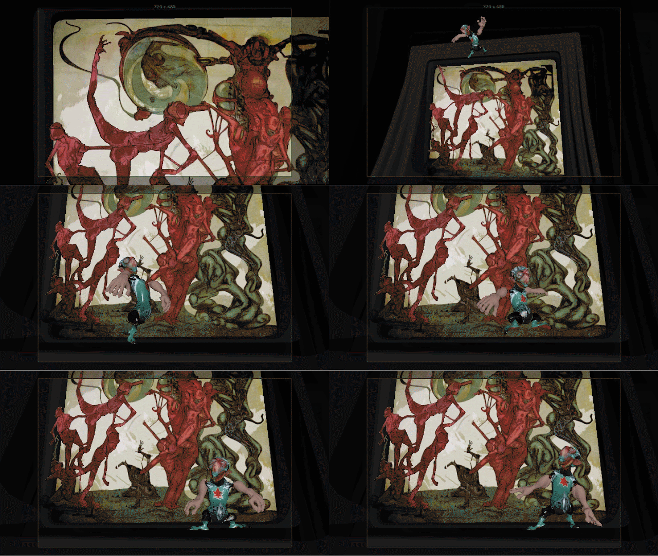
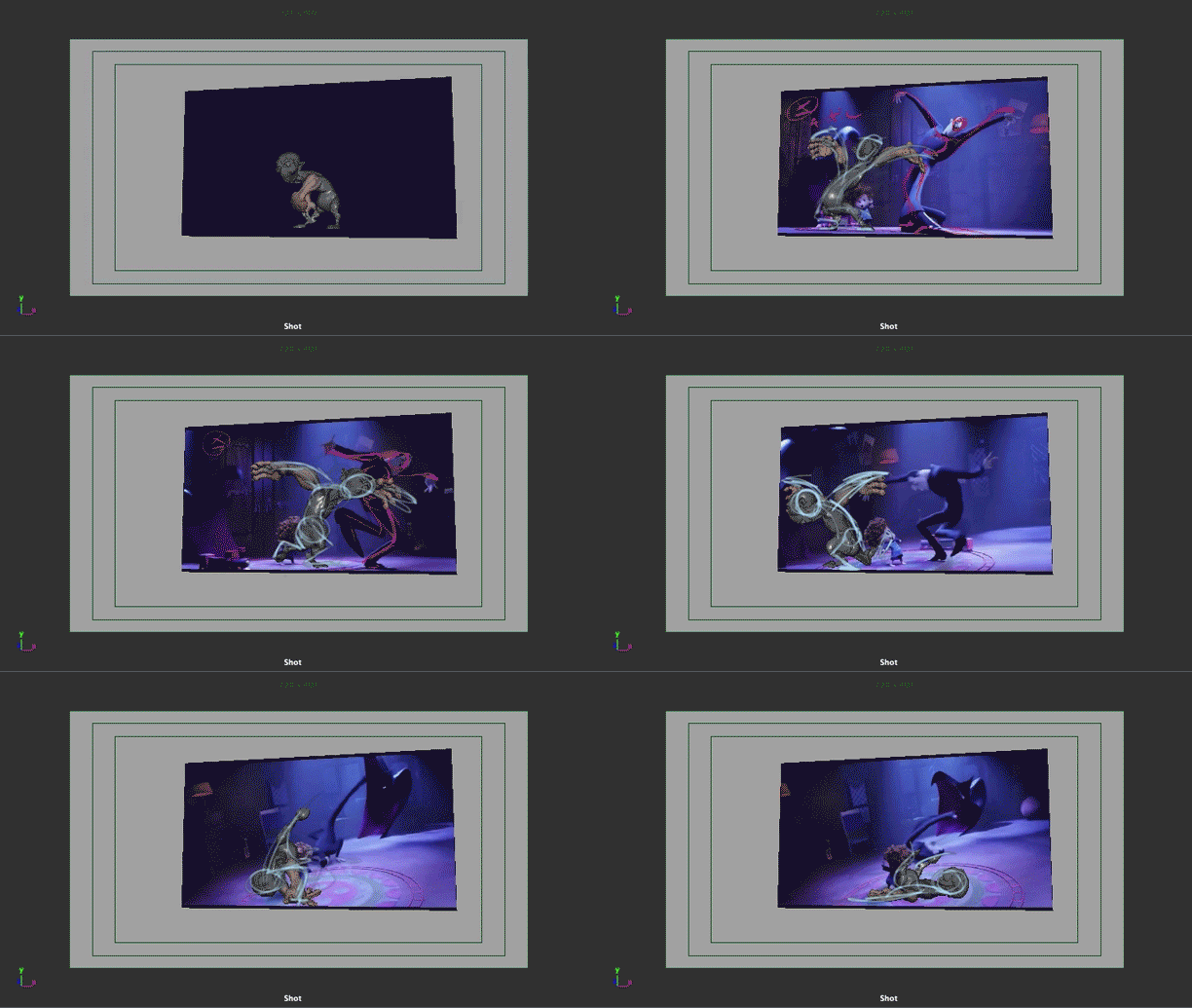
This is a progression of a scene I did showing various stages of concept and production. The whole project is a concept project with no final art or render.
My goal as an instructor at FullSail University is to inspire students and get them to explore their work, problem solve, and understand animation and mechanics better.
Teaching an animation Portfolio class, it is essential for students to develop concept/ pre-production methods as well as continue to develop their skills as animators.
These passes show the original thumbnail concept done with the grease pencil in maya, the creation and analysis of reference for the animation, a layout pass in maya, rig set up, then on to the block out and break down, refinement passes to emphasize that mindset, Background replacement (I used photoshop's 3_D tools to turn the flat back drop into geometry quickly), a more finished pass with lighting and fog play blasted in maya viewport 2.0, then a last quick pass to edit it together and a few quick tweaks in Adobe Premiere.


Monday, November 7, 2016

Layout tweak, and ruff Block out

Ok, on this pass as you can probably see I began to work on some of the animation for the character he is riding. I wanted to get the over all motion of that established, I tweaked my timing & camera some to continue to try and stage this so it reads well. Then I continued my block out of my character Timmy. I have the basic idea of how he will land, bounce and drag throughout this ride. Keys are laid out quickly, I'll go back and push them so they are as clear as I can get them before I move forward with more poses.

Wednesday, November 2, 2016

Timmy 1611- Layout

Ok, here's my next installment of my test. I consider this my layout pass. Very quick poses to stage the character and work with the camera and timing of the shot. I did reanimate my camera to pull in closer to better stage the action. Nothing else is really animated at this point, this would be the starting point to begin animation. I would suggest that when working on your own shots, that you should take time and tie down your camera and staging, and then work hard to stay within the boundaries you have created to make your shot work. That is what production will be like and you will learn a lot by working hard to make that animation work within those set up parameters. Not to mention, you will not go around and around adding more and more to your shot, which most of us are guilty of. By the way, did I say how important concepting and pre-production is before you dive into your product is ? Well now I did ;)

Tuesday, October 25, 2016

1611 Project Timmy

So here's my concept pass and some reference with a quick pass to analyze it and a look at the quick rigging job I did on the thang flying. Yes, I said thang. Again I'm using a painting from my one a day challenge, this painting really nails the feeling of the world my little guy lives in. The main creature element in this painting was in the original story, and he visited me in a very vivid dream years ago when I was writing and doing some visual development on the project. The model he flies on is something based on a pen & ink drawing I had modeled awhile back when I was trying to interpret my drawings into 3-D to bring into Timmy's world. Below this is a concept test I did years ago to rough out that creature and visualize who it might look and move. It's a simple primitive block out , rigged & animated quickly with a few effects to texture & dirty it up.

Thursday, October 20, 2016

More play and passes

So here's a look at me throwing a different idea into the mix here for the layout. I want to have something to start playing around with the final look of the character and world. I'd like to get a lot of layering and atmosphere into the scene. I'll be playing with more layers of animation, hand drawn, digitally drawn, and who knows. The pipes will be belching smog and I'd like to learn how to layer this and give some depth in a limited but noticeable way. I did do some more work on the character animation, but as usual it could still use another pass or two. This is just done using viewport 2.0 and some lights and a bit of motion blur.

Sunday, October 16, 2016

Pass, maybe 4, who really knows..........

Alright, I pushed forward and reworked my poses with the aid of the grease pencil sketches and then dove in and added some fun stuff for him to slide, hop, land and pose. Working for yourself, you tend to continue to add to your actions, at least I do and I'm sure many other artists would say the same. To me that is exploration and practice, that's where the growth takes place in you the artist. When you work on a production, or for students on a project for class, you should work closely with your director/ lead/ instructor and work to their directions. They are there for a reason and will help you make smart choices, adhere to requirements and focus on a workflow to get the job done quicker, with more focus & help you develop a workflow that will serve you in your career as well as your personal work. There is always room for your input and ideas even within the requirements of production and school assignments. I'll probably take another pass to finesse and smooth this out a bit. I had a fun time applying what I learned last month when I copied a piece of animation from Hotel Transylvania 2, a style of animation that I enjoy and would like to add some of that style to how I handle my character. Check that out on a previous post below on this blog.

Monday, October 10, 2016

Moving forward

Ok, moving forward and reevaluating my animation. I jumped right in and started pushing this towards completion, rethought my camera and wanted to add more animation to the end instead of just having my character slide to a stop. This test is less about the animation and more about connecting the style and world I would like to create moving forward with my character & his world. So I only did a very quick thumbnail sketch to prepare, and then dove in. Stopping for a moment and focusing back on the animation, I couldn't stop myself from drawing over my animation and push my and finesse my animation exaggerating the poses and cleaning up the arcs, and staging. I would definitely suggest that students try using the grease pencil in maya to evaluate and quickly try out edits to their animation. Another thing drawing over your poses does is free you from the limitations of your rig. I'm not too concerned about hitting the exact pose, but I will get creative and do my best to push it more in this direction. Getting used to dealing with the limitations of your rig and how to creatively achieve the performance you want takes time and a good understanding of the principles of animation. Now, I'll go back and push my poses closer to my scribbles, and yes, scribbles are good simple and quick; they are only concerned with the over all motion and core performance.

Sunday, October 9, 2016

Breakdown

Ok, second pass. I'll try and finish this up quick from here on, so I can have time to start playing with rendering. These next few test I hope to be able to figure out how I might texture, light and render my scenes. Time to go back to school a bit for myself; lot's to learn and play around with. I want to find an interesting balance with space, making the flat 2-D & 3-D elements work in a way that fits with my sensibilities in how I create my art and designs. I tend to work in limited space in my own personal artwork for a number of reasons that interest me, I'd like to see how I can bring that to my animated world.

Friday, October 7, 2016

Block out

Ok, here's pass one. This is a bit of a hybrid scene, more concept than animation. The timing is from my thumbnail pass. I'll worry about that later after I break it down a little. Since the layout and distance my character is traveling is very different, the timing I'm using on the thumbnail pass will change. I tend to not worry about timing much until I get further into the scene. And yes, I put a deformer on the frame I added to help change the shot from something very flat to more spacial.

Monday, October 3, 2016

Scene set up & rigging

Quick look at the scene set up. This is me testing some ideas on how I might create my interactions with my characters world. I've always loved the multi-plane camera that was used in the classic Disney movies that interesting play you can get between the layers. Lot's of play and tests to do to start to understand how I might create Timmy's world.

Monday, September 26, 2016

October project thumbnail concept

I have talked about the benefits of creating, analyzing, & using reference; last month, the value in copying animation, this month's piece is a little different. The animation is something, that I am not physically capable of doing, and I want it to be unique to my piece, so I have done a quick concept pass. Thumb nailing is definitely something any animator should take time to develop skill for. To quickly scribble out something that helps you visually create your concept is the goal. For me with this test it was more about a quick zippy action that would make my character interact with the BG painting. I took a digital painting of mine I did in my "One a Day" challenge I did last year and imported it in maya onto an image plane, then used the Grease pencil to thumbnail the animation. Tangent: I challenged myself to drawing something & paint and post it every day of the week for a while year. Here's a link to my website page where I posted these paintings. Now the interesting thing that happened when I did this is that I was creating a bit of style guide for my characters world. When I look at a lot of what I did, it is to me, very clear that it's a rough study of my characters world. It wasn't exactly my plan to do this, it just happened.
Here's a shot of me setting up my scene, I'll be mapping the painting to the geometry I'm building here in order to rig it and animal the interaction. Testing phase begins.

Progression

Here's the progression from clip & analysis, to Keys & Breakdowns, & not quite the finish, but as far as I had time to take it. Once again, I could have used a couple more passes on this. I had only just started deviating form the original animation clip, and having a little of my own fun, and haven't cleaned it up and finessed it nearly enough. the spin at the end definitely needs more tlc.

Sunday, September 18, 2016

5th Pass

Ok 5th Pass. Having fun with arcing Timmy's hands, seems appropriate for him with those arms and hands, and hell it's just fun. More clean up in the graph with the progression, this takes focus to orchestrate the rotations & counters to be smooth, it's also a great way to really control your spacing to get the performance you are looking for. For those of you who are pursuing animation as your discipline, get in the graph and make it part of your workflow !!! The other thing I'm having fun with is the use of timing and spacing holding keys for 2 and 3 frames and pushing my exaggerations on ones in the fast actions. Look at the peak of the jump back and the landing afterwards for some 2's and 3's.

Tuesday, September 13, 2016

4th Pass

Ok, 4th pass. Out of stepped. I pretty much stuck to the timing and spacing from the clip and use of slow-outs & slow-ins, poses on 2's & 3's, yes, there was one pose held for 3 frames. See if your eye can catch it. This could definitely use a few more hours of just smoothy some things out in the graph, and tightening up arcs. I'd like to take at least one last pass with this and move away from the reference and see what I can add to it from my own animation toolbox. This style of animation is so appealing to me. It's all about those Strong Keys, and how you get in and out of them, don't forget , how long you stay in them, so we can actually see those poses. The use of timing and spacing is so huge here too. If you understand this, you understand the basic foundations of animation. Yes, I know, you asking yourself, why is he animating instead of grading me milestone 2 turn in. Fair question.

Saturday, September 10, 2016

3rd Pass

Another pass, adding some breakdowns in. I'm posting these in stepped, but I work out of stepped, using mayas in-betweens to help create breakdowns, and I also like to be able to keep an eye on my rotations and fix them out of stepped. Up until now, I have not ben concerned with the timing and feel of the piece. I'm just using the reference and recreating it as best as I can with my rig. This is a very extreme piece of animation, not a lot of in-betweens, not much work to leave to maya. Now I'll start trying to break it down further and finesse it. Next time you see it it will be out of stepped and hopefully feeling a bit smoother.

Thursday, September 8, 2016

2nd Pass

Ok guys, 2nd pass, Really 3rd. 1st pass, consisted of a quick ruff out and then a 2nd pass on the keys. This pass has the rest of the keys in it, with a lot more work in the graph editor to smooth out rotations and clean up any rotation problems throughout the characters hips, hands, & feet. Yes, with something rotating this much you can get gimble, or just wind up with rotations that are not working throughout the body. That's why this scene is better handled straight ahead, to keep track of your direction in rotations. I put quite a few poses in it to help keep track of the rotations, but he's spinning so fast it is still hard to nail them. All can be solved in the graph editor though, make friends with your graph your life depends on it, or at least your animation does. Next pass will get all the major breakdowns in, another tweaking session on all the keys poses again, and more graph editor work to keep this as clean. After that, I will probably pull away from the reference and have some of my own fun.

Tuesday, September 6, 2016

Portfolio 2 1609 demo Block-Out with notes

Ok 3DA2 1609 For this month's scene I decided to use a piece of animation and recreate it with my rig. If this is something you have not thought of doing, you are missing out on a great way to practice and learn from someone else's hard work. You can learn a lot from studying and copying. The idea for me was to try and get some of the wonderfully fun style of Genndy Tartakovosky from Hotel Transylvania into my tool box. Trying to keep up with this style of animation is going to be a very big challenge with my 3 dollar rig, especially in such a tricky scene with quite a bit of rotations. Check out that video I posted on rotational order, and google Gimble lock if you are foggy on these things. I'll probably stick close to it until I get it moving fairly well with most of the poses needed, and then I will have some fun and add my own style into it. What you are looking at here is a playblast of my Hotel Transylvania reference scene with my mark up notes on a image plane, the block out and a quick grease pencil draw over. I did a quick first pass with my keys trying just to ruffly lay in the main keys and a good foundation with the characters mechanics in the perspective view. I put in more keys than I had planned to on the first pass to handle the spin, it being a very fast and complicated action that should be handled as a straight ahead animation approach rather than a pose to pose. Then I drew over the poses I had created from the shot camera to show how I wanted to push the poses to work better within the context of the motion it was intended to create and to also work as best i could from the shot camera view. Then I pushed my poses closer to my ruff notes. While I was doing all this, I was working in the graph editor to make sure that I was keeping my character clean from having gimble lock issues. I had already changed my rotation order on the rig to XZY before I began my scene. Y being the most use rotation, and X being used quite a bit when he dips int the spin.

Sunday, August 28, 2016

5th Pass

Ok, this is as far as I had time to make it this month. Much too long of a scene to finish in time. Good lesson for everyone, including me, don't bite off more than you can chew, the old Quality versus Quantity. So, I got through my 5th pass. Still need about two more passes through this to get it ready for prime time. Just to get it to feel a little better I added some blinks and worked on the transitions of some of the expressions. There is plenty of work left at this point. I have done very little tweaking of curves at this point, all the clean-up of curves and smooth out in-betweens & strengthen arcs is missing at this point. Some of the actions still need some softening and finessing. The hands have been worked a little more, but are still not complete. Like I said the Lion's share of the work, I'd say, at least two days work left, two long days. Best wishes to everyone in class moving on with there studies and best wishes for a happy and successful career.

Monday, August 22, 2016

4th Pass

Ok, so this is the scene out of stepped after I've taken a run through it and Broken it down more, slow-ins, moving holds, more breakdowns, some added anticipations. As I spoke about before a whole lot of wresting with Timing & Spacing, checking arcs. Trying to get an interesting pacing of my ideas. Basically playing with how my character should move. I still have not got a clear idea of the feel I want him to have. Next month probably a shorter scene so I can focus on a style. This is still not even close to being finished. Although I have done some work on the hands and fingers, much more needs to be done, rotates and arcs need to be finessed and cleaned up. Face needs to be broken down and animated, Blinks, Brows & Eye darts to give him some life, the end part needs some breaking down still. And you may have noticed his hands cutting through the walls when he comes up in the elevator. That's what you get when you hide your BG for too long. This is about 19 seconds worth of animation, like I said when I pitched it to you, this is a big involved scene.

More Breakdowns, & some Refinement

Ok, as you have seen in class, I've been showing you where I am now with my scene. It's out of stepped, and I'm as I termed it wrestling around with many things to get the over all performance to work. I'm adding in my other pass of Breakdowns, that include slow-ins, & moving holds. I'm reworking timing and the spacing of poses to get some texture that suites my type of character in my scene. That is what this is an example of. Before I was showing you examples of this with many changes going on throughout my characters whole body. This is an example of the use of timing & spacing changes just focused on my characters right hand when he grabs the gate just before he walks out. Now I was happy with the overall timing & action of my characters body moving out of that section, so I did not want to change the timing of the over all poses. I started by adjust the hand & fingers poses (SPACING), throughout that section to speed it up and get more of a crisp snap to it. Once I pushed it as far as I could get it, I put in a couple of keys just on the hands to control it more. After I pushed it too far I brought it back some so I could not see the distortion of the fingers. I'll tap through this in lecture to show you the difference in the poses that are creating the change.

Friday, August 12, 2016

3rd Pass - Breakdowns

Ok, 3rd pass. Adding in the major breakdowns at this point. For my students, keep in mind how important Breakdowns are in animation. They are usually the most interesting and dynamic poses in your scene. They create the arcs, and offset the action in so many ways. Since they are in motion, they give you the power to drag things so everything is not moving at the same rate or time. They can favor in both the timing & the spacing, so that you can bring more texture into the movement of your scene. When you think of texture, think contrast. At this point I'm still using my reference, although I am exaggerating greatly and starting to alter my timing a bit. My poses are not set in stone as I move forward everything will be up for debate as I move out of stepped and start adding my slow-ins and moving holds, I'll be constantly tweaking my timing and the poses to get the feeling I'm going for with my character. It becomes a big wrestling match with those two very important things Timing & Spacing.

Monday, August 8, 2016

Second Pass

Ok, Second pass. I laid in my next pass of keys. I call them lesser keys, which consist of other anticipations,& keys, which I felt could be left out without losing too much in my 1st pass. Like I said in class, many people will have their own opinions on the exact label of a pose as it relates to keys, breakdowns, some of us have sub-catorgories. To sum it up it's a way to go from the Macro to the Micro, working from the Bigger idea down to the fine details, work-flow or in this case- AKA Pose to Pose one of the Principles. As long as you are clear on the pose and what it is doing to help create the action in your scene. These poses can all be considered extreme poses, without them the character will be missing something in the interpretation of the reference I'm working from. I'm still not concerned with my timing at this point. I'm using the timing of the reference just as a guide. After I get my breakdowns in and am happy that I have what I need from my reference, I'll start working with my timing. My character is a very cartoony type of character so I'll be pushing farther and farther away from my reference, exaggerating much more. The broader I move him the more I will have to work with my timing. Everything leads back to Timing & Spacing. I cannot use the same timing from my video if I change my spacing that drastically without him moving much quicker and maybe popping too much. Again, at this point I'm more concerned with good strong poses other than motion, checking to see that the mechanics are doing what they need to and that the poses relate to each other while also keeping in mind what I'm seeing in my reference. I'm going back and forth from the perspective window to the shot camera and working in the graph editor to keep my progression clean and tweak my poses.

Saturday, August 6, 2016

Block Out / 1st Pass

So I'll just write this from the point of view of talking with my students. At this point don't worry about seeing your animation move with interpolation / in-betweens, in stepped your focus should be about staging and mechanics to tell the story and build the framework of how your character will move in and out of those Key ideas. I've blocked out my key poses and took a second pass to try and design and push the poses before I move on and add more poses. I've tried to make good decisions with the mechanics of the poses & staging. The silouhette, line of action, use of negative space, and over all appeal. Keeping in mind the type of character I am animating I want to exaggerate my poses to suite him, and make good choices on how I use & stage his large forearms. At this point the keys are strong enough that I will move on and add the rest of my keys knowing that all of these poses will continue to be tweaked in the process so that all the poses are working together to create the action. I'm using the timing from the video, and the poses just as a guide right now, as I continue through the scene, I will start abandoning the reference and reworking the timing to better suite my character and animation style. Although it's early on in your development with computer animation you should be aware of how you are creating your poses and the progression in the graph editor. Much like the clean up and progression of the walk, your whole scene should be looked at in the same manner. Keeping your progression smooth starting with the block out is a extremely important part of your workflow if you want to excel at computer animation. Ask e more about this in lab for specifics about your scene.

Wednesday, August 3, 2016

Reference Analysis 3DA2_1608

So this is the start of the August Portfolio 2 class I am teaching at FullSail University. I plan to post the animation and process I do each month as inspiration, demonstration, & general love of the medium that I share with my class. In my class I really stress the use of reference, creation & analysis, with a strong emphasis on mechanics. Here is the reference I created for this month with some quick notes to start defining the Key & breakdown poses and start to define the mechanics of those poses. I've broken this down to what I refer to Keys, lesser Keys, and then main Breakdowns. There are still more breakdowns to be found, slow ins & Holds and such. I'll be animating my Character I created, modeled & rigged (Rig still in progress). I'll post the block out soon.

Sunday, November 25, 2012

Thanksgiving break Drawings


2 more for the pile, would be nice to start doing some large paintings like this, and getting back to some sculptures in this realm.

Saturday, November 24, 2012


Taking advantage of a little time off at thanksgiving to do a couple of drawings

Friday, September 21, 2012

Sunday, September 2, 2012

Thursday, November 17, 2011

4 more for the pile


Just 1196 left and I'll get started on some real drawings. I had better pick up the pace a bit.